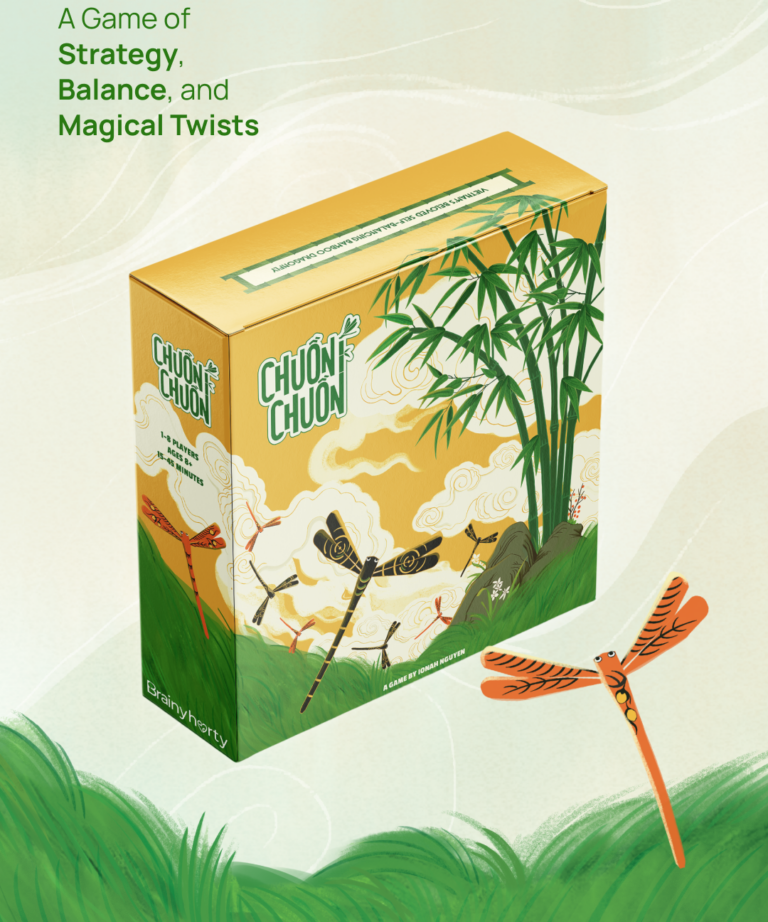
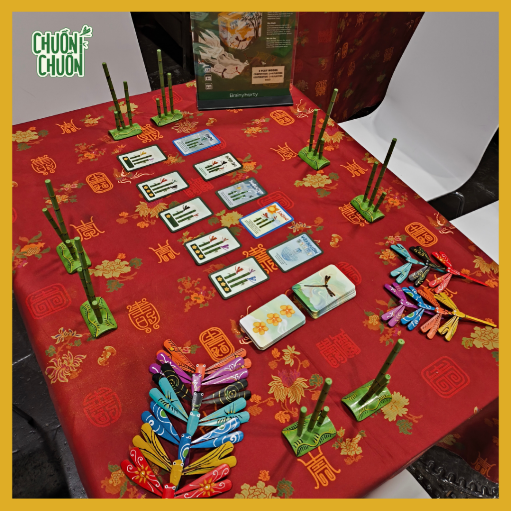
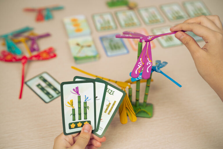
Chuồn Chuồn – our most recent game – is inspired by Vietnam’s traditional balancing dragonfly toys. Those charming little figures you can perch on your fingertips. We turned that idea into a light strategy game where players catch colorful dragonfly pieces and arrange them on bamboo trees, trying to match the patterns shown on their objective cards. The patterns players need to match involve three things: color, size, and position.
Color, as it turns out, was about to become more important than we expected.
The Small Thing We Kept Noticing
We ran many playtesting sessions for Chuồn Chuồn over the course of three months. There was a lot of encouraging feedback. Rules are getting clearer, the pacing feels better, and most importantly, players are genuinely having fun.
But sprinkled across those sessions, we kept noticing something small: every now and then, a player would mix up the colors of the dragonflies shown on the objective cards. A quick “oops,” a laugh, and the game moved on. 5 minutes later, nobody even remembered that ever happened, easy to overlook.
The thing is, we couldn’t quite let it go.
Making Chuồn Chuồn, or any of our games, accessible and enjoyable for everyone has always been a core goal for us. If even a small moment of confusion was happening more than once, it felt worth taking seriously. So instead of brushing it off, we decided to dig into it properly.
What We Found
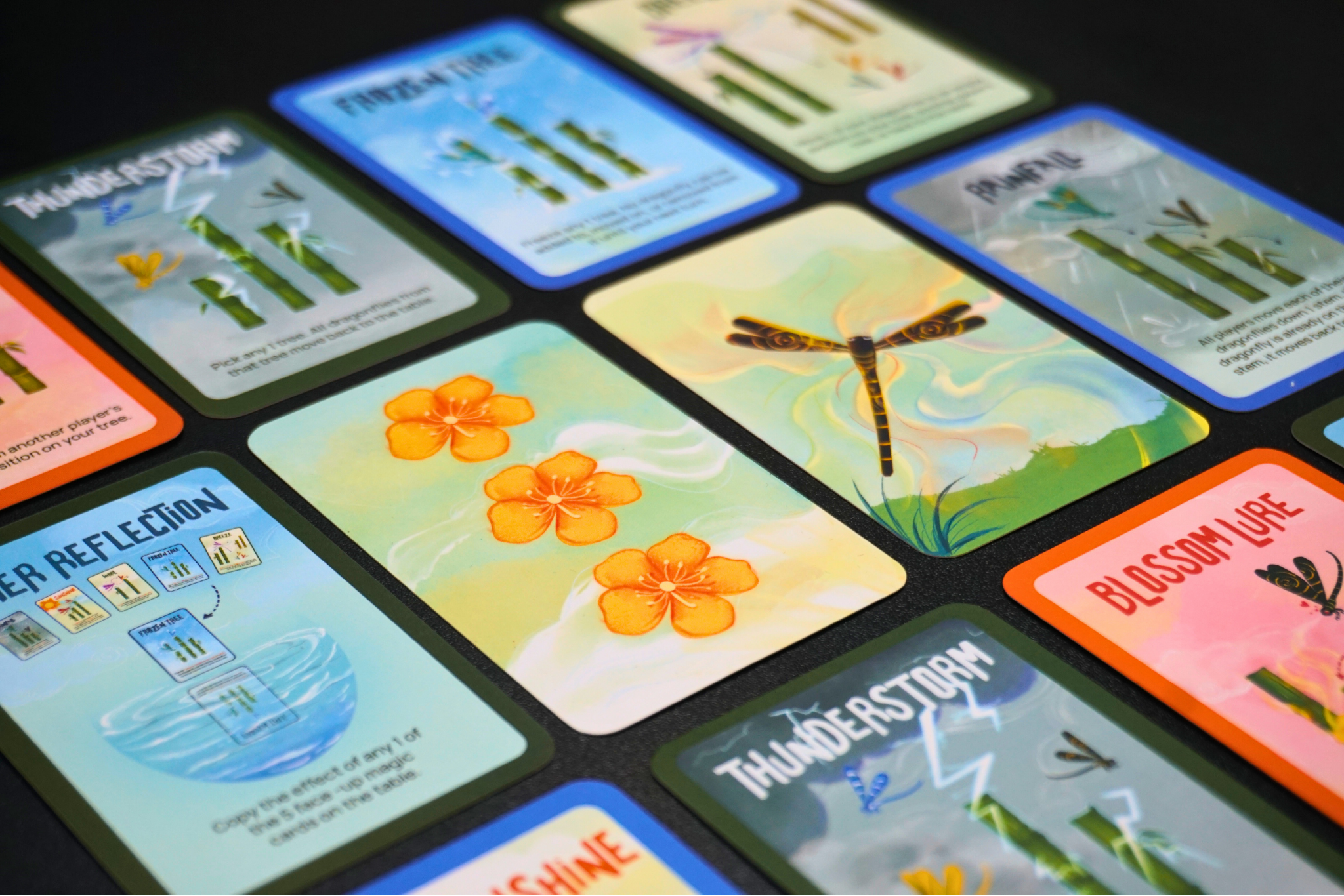
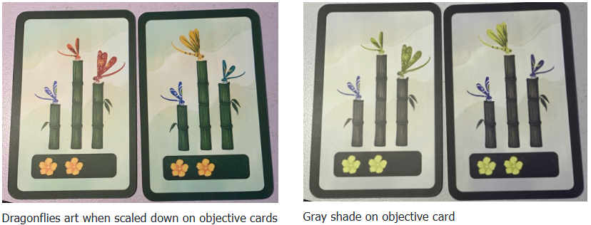
The first thing to understand is that Chuồn Chuồn has two different places where dragonflies appear: the physical bamboo dragonfly pieces that players handle, and the objective cards, which show small printed illustrations of dragonflies that players need to match.
The physical pieces are large enough that distinguishing them is generally fine. But on the cards, where those same dragonflies are printed as small illustrations, some colors become genuinely hard to tell apart – especially for players with color blindness.
We ran our card designs through CVD simulators, tools that show you what your visuals look like under different types of color blindness, and two problems jumped out immediately.
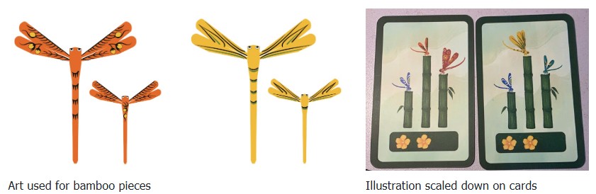
Problem 1 — The dragonfly illustrations all had similar patterns on their wings
All seven dragonflies’ art used the same style of rounded, flowing linework. At full size, this looks beautiful. But when those illustrations are shrunk down to fit on a small card, the details blur together. Without distinct silhouettes, players end up relying entirely on color to tell them apart – which is exactly what we can’t ask color-blind players to do. The example below shows similar patterns seen on orange and yellow dragonflies’ wings on cards.
Problem 2 — The colors were too close in brightness
Even though the seven dragonfly colors look different to most people, they all had very similar brightness levels. (Designers call this luminance – think of it as how light or dark something appears, separate from its actual color.)
When you strip out color information, which is essentially what happens under many types of color blindness, all seven dragonflies blur into a similar range of grays. There was almost no contrast left to work with.
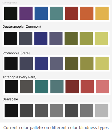
These two problems made each other worse: similar shapes and similar brightness meant some players had almost no visual information to go on when reading the cards. The example below shows how easy it is to get confused between orange, red, yellow and blue, cyan on the current pallete. At a glance, it’s rather easy to get them mixed up.
How We Fixed It
We applied color changes to both the physical dragonfly pieces and their card illustrations, so everything stays consistent. Here’s what we changed and why.
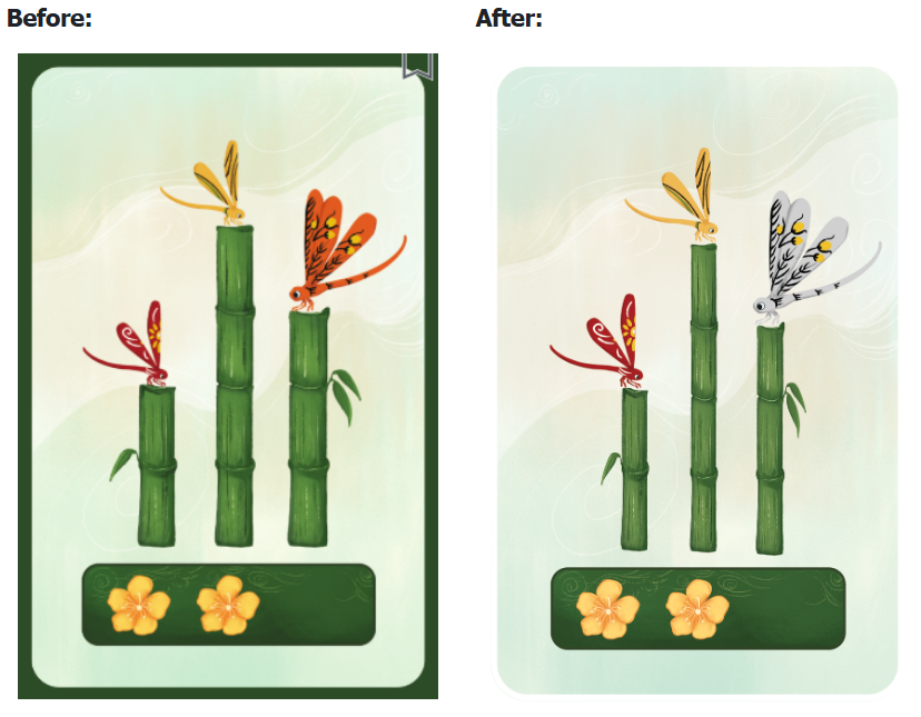
Blue, Cyan, and Purple
These three were the trickiest group. Under the most common forms of color blindness, cyan and purple end up looking nearly identical in brightness. When scaled down on objective cards, blue joined that muddy middle ground too.
Our fix worked on two levels:
We adjusted the cyan color itself. By shifting it to a brighter, clearer range, we created more distance between cyan and purple on the brightness scale. So even without color, they now read noticeably different.
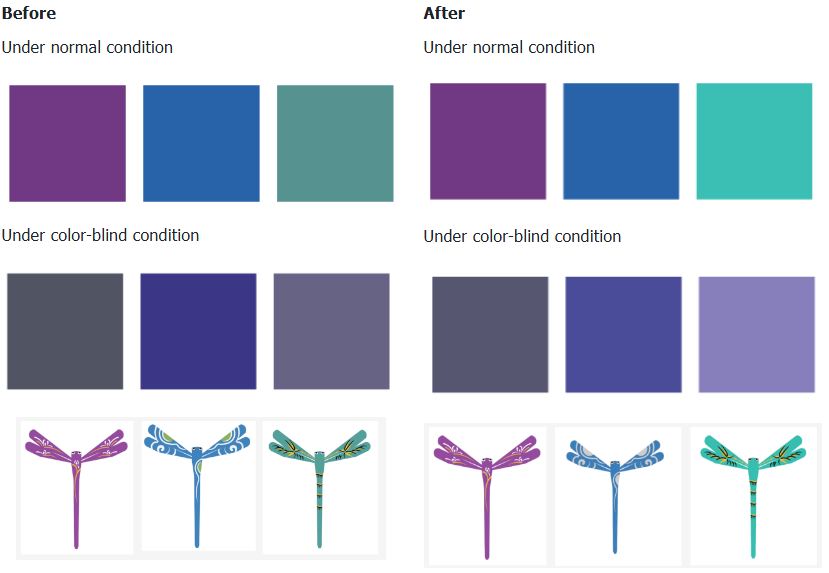
We changed the pattern on the blue dragonfly. The old design used white and green details. We replaced it with a fully gray-based pattern. Why does that matter? A gray pattern creates shape contrast, not just color contrast. Under color-blind conditions, blue and cyan are now easy to tell apart at a glance. One has a bold visible pattern, and the other doesn’t.
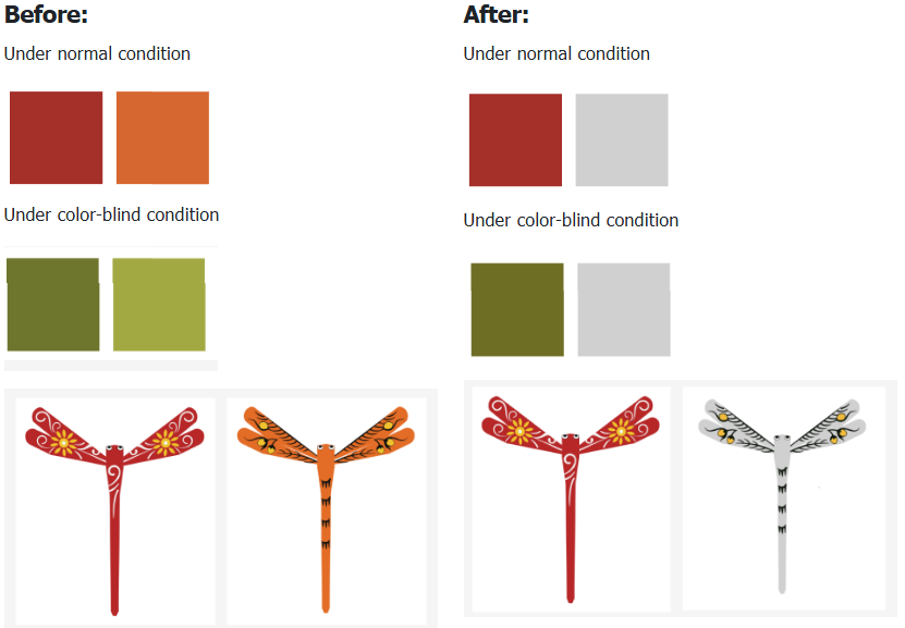
Red and Orange
The same brightness problem showed up here too. Red and orange sat too close together on the brightness scale, making them nearly indistinguishable under color blindness simulation.
We replaced orange with a light gray, chosen specifically from a color-blind-friendly palette. The result is a much stronger contrast: dark red against light gray reads clearly even when color information is removed.
A Little Extra: Redesigning Objective Cards
While we were rethinking the cards, we also took the opportunity to make the dragonfly illustrations bigger and easier to read. We made three tweaks: enlarged the dragonfly illustrations, reduced the size of the bamboo trees to free up space, and removed the border frame around the card.
The goal was simple: give the dragonflies more room to breathe, so players can clearly see what they’re looking at, even at a small scale. Less visual noise, clearer recognition.
Moving Forward
We’re genuinely proud of these changes, but we also know this is just one step. Accessibility isn’t a box you check, it’s something you keep working on.
We want to make sure this new version truly works for everyone. If you play games with color blindness, or if you have experience with accessible design, we’d really love to hear from you. Does this approach look right? Is there anything we missed?